The Caution Triangle as a Boundary: Reading ‘Not Friendly, Do Not Touch’
Three words sit above a yellow triangle. Inside the triangle, a hand is crossed out. Below, three more words: DO NOT TOUCH. The lettering is set in the visual grammar of a hazard placard — the kind of sign that tells a worker to keep back from a moving part, a hot surface, a live wire. The shirt does not depict a hazard. It borrows the hazard sign’s authority and points it at a person.
That borrowing is the whole design, and it is worth taking seriously rather than filing under novelty. A warning sign works because it is impersonal, standardized, and issued by someone with the standing to issue it. The Not Friendly Do Not Touch shirt takes that apparatus and relocates it onto a body. The result is a small, legible argument about who gets to declare a boundary and in what language.
What the sign actually says
Read literally, the artwork makes two claims in sequence. The first is a status: not friendly. The second is an instruction: do not touch. The caution triangle and the crossed-out hand sit between them as the visual hinge — the symbol that converts a description of temperament into a rule of conduct.
This is not the same as a shirt that says “introvert” or “I need space.” Those phrases describe a preference. A warning sign issues a directive. The crossed-out hand is doing specific work: it does not depict a hand being refused; it depicts the refusal as a prohibition, the way a no-parking sign depicts a circled P. The design’s wit comes from the mismatch between the bureaucratic register of the sign and the intimate register of the body wearing it.
I want to be careful about what the yellow triangle means. In workplace safety systems, the yellow triangle is a general caution symbol, distinct from the red circle-and-slash prohibition sign. The shirt uses the caution triangle as a frame and places a prohibition symbol inside it. That is a small visual inconsistency — a caution sign containing a prohibition — and it is the kind of inconsistency that a real sign shop would avoid. On a shirt, it reads as deliberate compression: caution and prohibition collapsed into one graphic because the wearer wants both meanings at once. I am interpreting the design here, not reporting a standard.
The boundary problem
The interesting question is not whether the shirt is funny. It is what kind of social transaction the shirt proposes. A boundary, in the ordinary sense, is something a person communicates to another person in context — with tone, timing, relationship, and the possibility of negotiation. A printed warning sign strips all of that away. It is a boundary that has been pre-issued, generalized, and made visible before any particular interaction begins.
That is either the shirt’s limitation or its point, depending on how you read it. As a limitation, it is blunt to the point of rudeness: the wearer has decided in advance that the answer is no. As a point, it is a way of refusing the labor of explaining oneself repeatedly. Anyone who has spent a day being approached, questioned, or touched without invitation knows that the labor of the polite refusal is real and unevenly distributed. The shirt offloads that labor onto a garment.
There is a parallel worth naming, though I want to keep it modest. Public-facing workers — transit staff, retail clerks, security guards — have long used uniforms and signage to manage approach. The “do not touch” instruction is not new to public space; what is new here is its migration onto civilian clothing as a personal style choice. The shirt borrows the authority of the workplace sign and spends it on the wearer’s own behalf. Whether that borrowing is clever or presumptuous is a judgment the reader has to make.
Why the introvert framing undersells it
The retail title files the design under “introvert,” and the keyword people use to find it is the not friendly do not touch shirt. That framing is understandable but slightly off. Introversion is a description of how someone replenishes energy; it is not a claim about friendliness, and it is certainly not a claim about touch. The shirt’s text is more specific and more confrontational than the introvert label suggests. It does not say “I am tired” or “I need quiet.” It says “not friendly” — a statement about social availability — and “do not touch” — a statement about physical access.
The gap matters because it changes who the shirt is for. An introvert-themed shirt invites recognition from other introverts. A warning-sign shirt invites a different reading: it is a boundary marker aimed at the people most likely to cross it. The design is less a self-description than a preemptive refusal. That is a sharper, less communal posture than the introvert framing implies, and I think the shirt is more interesting for it.
The crossed-out hand and the question of touch
The crossed-out hand is the most consequential element. Touch is not a neutral category. Casual touch — a hand on the shoulder, a hug hello, a tap to get attention — is distributed unevenly across bodies and relationships, and the expectation to receive it gracefully is itself a social pressure. A shirt that prints a prohibition on touch is making a claim that most clothing does not: that the default assumption of physical access is wrong.
I am not going to overclaim here. A shirt is not a policy, and wearing one is not activism. But the design does something that a slogan like “respect boundaries” does not: it makes the boundary visible in advance, in the same visual language that institutions use to regulate conduct. The caution triangle is doing the work of legitimacy. It says: this is not a mood; this is a rule.
What the shirt asks of the person reading it
The design’s real audience is not the wearer. It is the person standing in front of the wearer, reading the sign. That person is being asked to do something unusual: to treat a printed graphic as a binding instruction, to accept the borrowed authority of the hazard placard as if it applied to them. Most people will read it as a joke, and it is one. But the joke only lands if the underlying instruction is at least partly meant.
This is where the shirt differs from a purely decorative graphic. A novelty shirt that says “World’s Best Dad” makes no claim on the viewer. A shirt that says “do not touch” does. It proposes a rule and dares the reader to treat it as a rule. The humor and the boundary are the same gesture, which is why the design works better than a straightforward “introvert” shirt: it gives the wearer a way to be serious and funny at once, and it gives the reader a way to comply without making it awkward.
The limits of the form
I would not pretend the shirt solves anything. A warning sign on a body is still a sign on a body, and the people most likely to ignore it are the people least likely to read it carefully. The design’s authority is borrowed, and borrowed authority is fragile. It works best in low-stakes, high-visibility settings — a crowded room, a party, a workplace where the joke can do the work of the boundary. It works least well where the boundary actually needs to be enforced, because a shirt cannot enforce anything.
That is not a flaw in the design so much as a limit of the medium. The shirt is a conversation piece that happens to be about consent and access, and its value is in making those topics visible in a form that is easy to comment on. The caution triangle gives people a way to ask the question — “is that a joke?” — which is often the first step toward a real conversation about who gets to set the terms of approach.
Reading the sign as a small civic statement
The design’s most interesting move is its use of public-sign language for a private boundary. Public signs are addressed to strangers; they assume no relationship and no context. That is exactly the condition the shirt is designed for: the crowded room, the unfamiliar gathering, the moment before any relationship exists. By adopting the sign’s grammar, the shirt says something that is hard to say in conversation without sounding hostile: the default is no, and you need a reason to change it.
Whether that is a healthy posture or a defensive one is not something a shirt can settle. But the design is legible, specific, and honest about what it wants. It does not ask to be liked. It asks to be read. In a category full of vague mood statements, that is a real distinction, and it is why the caution triangle earns its place on the chest rather than sitting in the background as decoration.
Editorial note: This publication and Quirky Cotton Collective share an owner.

The Warning-Sign Shirt: What ‘Not Friendly, Do Not Touch’ Asks of the Person Reading It

The Fourth Industrial Revolution: More Than Just Tech Buzzwords
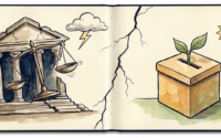
When Courthouses Empty: Mexico’s Judicial Revolution Hits Main Street
About Author
