The Caution Triangle as a Boundary: Reading ‘Not Friendly, Do Not Touch’
The shirt does not say shy. It does not say quiet or reserved or please give me a moment. It says NOT FRIENDLY in the flat, capitalized register of a hazard placard, sets that phrase above DO NOT TOUCH, and frames the whole instruction with two borrowed instruments of public safety: a yellow caution triangle and a hand with a diagonal slash through it. The design is not a mood. It is a notice.
That distinction is the whole argument. Most introvert merchandise translates a temperament into an apology — sorry, I’m awkward, socially exhausted, running on empty. This artwork skips the apology and adopts the grammar of the sign instead. A caution triangle is not a request; it is a warning issued by whoever controls the space. A crossed-out hand is not a preference; it is a prohibition. The shirt takes the visual vocabulary that institutions use to manage risk in shared space and repurposes it for a single body. The question it raises is not whether the wearer is friendly. It is who gets to declare a boundary, and in what language, before anyone else has a say.
What the sign actually says
Read the elements in order. The caution triangle is the most standardized piece of the design: a yellow field with a dark border, the shape that road authorities and safety officers use to signal attention required. It carries no content of its own — it is pure alert, a frame that says read the next thing carefully. The next thing is the text. NOT FRIENDLY is a verdict, not a feeling; it describes the wearer from the outside, in the second person of a label someone else might apply. DO NOT TOUCH is an imperative, and imperatives are the grammar of authority. Then the crossed-out hand: the universal pictogram for no entry, do not handle, keep away. Together the elements form a complete regulatory sentence — hazard, classification, prohibition — assembled from the visual system of public signage.
That is an interpretation of the design, not a claim about its history. I am reading the visible artwork: the lettering, the triangle, the hand, the slash. What the shirt does with those parts is borrow the authority of the sign and redirect it at the person standing closest.
The boundary that arrives before the person
Here is the useful tension. A boundary is normally something you negotiate — you meet someone, you read the situation, you say I need a little space or not right now. The shirt front-loads the negotiation. It issues the conclusion before the introduction. The wearer does not have to explain, soften, or perform availability; the garment performs refusal on their behalf, in a register that is hard to argue with because it looks official.
That is a real social move, and it is worth naming precisely. The design does not ask the reader to understand introversion. It asks the reader to obey a sign. The difference matters because understanding is a burden placed on the wearer — explain yourself, be patient, let me get to know you — while obedience is a burden placed on the reader. The shirt transfers the work. Whether that is generous or hostile depends entirely on the room, but the transfer is the point.
Why the warning-sign grammar is doing the work
Consider what would be lost if the same sentiment were set in a friendly rounded font with a smiling face. Not friendly, do not touch in pastel script reads as a joke about being grumpy; it invites the reader to chuckle and lean in anyway. The caution triangle and the crossed-out hand foreclose that reading. They are not cute. They are administrative. The humor, such as it is, comes from the mismatch between the bureaucratic severity of the form and the intimate scale of the subject — one person’s shoulder, one person’s afternoon. That mismatch is the entire engine of the design, and it only runs because the sign language is taken seriously.
This is also why the shirt is not really about introversion as a personality category. It is about the right to be legible on your own terms. A person who wears it is not claiming to be unfriendly in fact; they are claiming the authority to post a notice. The design lets them do that without speaking, which is precisely what someone who does not want to be approached might need.
The reader’s side of the sign
Every warning sign implies a reader who might otherwise do the dangerous thing. The crossed-out hand assumes a hand that was reaching. So the shirt is also a small theory of other people: it assumes that proximity is the default, that touch is the unspoken expectation, that friendliness will be demanded before it is offered. The sign exists because the behavior it prohibits is common enough to require a pictogram. That is a bleak little premise, and the design does not soften it. It simply posts the notice and moves on.
What the shirt asks of the person reading it, then, is not warmth. It is literacy. Read the triangle, read the text, read the hand, and adjust. The garment is testing whether the reader can take a boundary at face value — without negotiating it, without treating it as a invitation to charm the wearer out of it, without deciding that the sign is a cry for help. The most respectful response to a caution triangle is to slow down and keep your distance, and the shirt is asking for exactly that.
The object itself
The shirt is sold as the Not Friendly Do Not Touch Funny Warning Sign Introvert by Quirky Cotton Collective, and the visible design is the one described above: the warning-sign lettering, the yellow caution triangle, the crossed-out hand. I am not going to tell you how it wears or how it fits, because I have not worn it and the listing does not establish that. What the artwork establishes is the argument: a boundary expressed in the language of public safety, issued before anyone has a chance to ask.
That is a more interesting object than a slogan about being tired of people. It is a small piece of signage for a body, and it works because it refuses to be charming. The caution triangle does not apologize. Neither does the shirt.
Editorial note: This publication and Quirky Cotton Collective share an owner.

How Environmental Impact Statements Tell Stories: Narrative Structure as Regulatory Power and the Counter-Documentation That Challenges It
The ‘Meh’ Shirt: What Large Lowercase Type Asks of the Person Reading It
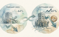
The DOGE Doctrine: Measuring the Real Governance Costs of Elon Musk’s Federal Workforce Reduction Campaign
About Author
